

Gantt Chart in Excel and Google Spreadsheets
Gantt chart is an easy-to-use and visual tool of representing current tasks in real-time mode. Such a chart allows to see not only the number of available tasks, but also their priorities, volume and time left for completion. Many project managers say that using Gantt charts protects them from missing deadlines. This is an opportunity to always see in what sequence to solve tasks and not to forget about any of them. Moreover, you don’t need to have any particular software to work with this free handy tool - Gantt chart in Excel can be as handy as its analogue created in a more specific environment. And let’s discuss below how to create a chart in Excel and to work with it, and who it may be useful for.
What is a Gantt chart?
By definition this is a type of bar charts, where each separate column (row) matches a particular task. Depending on location and size it illustrates time when the work at a certain stage was started and finished. One can place tasks in the Gantt chart both according to the sequence of the work you do and to the priorities. Hence, it’s possible to create charts when using the traditional in-line project system, when it’s important to follow the initially set sequence, and when using flexible methodologies which allow editing the tasks lists and their priorities.

Originally such bar charts were created by Henry Gantt for managing engineers’ activity and tasks at the English shipbuilding facility. He gathered all employees’ tasks into separate lists, allocated the required resources and defined how each task depends on another one. Also, he calculated the timeline for completing the tasks, the working hours needed for each separate task as well as responsibilities of a particular employee for the completion. Then Gantt moved the obtained results to the chart adding times, and thus got a model vividly illustrating the project structure, progress and volume of each task in its structure. Afterwards the Gantt charts have been changed and modified, new ways of their creation have appeared, including the ones with the help of Excel tools, still their nature remains the same.
Who is a Gantt chart useful for?
An opportunity to create such a chart-planner of activity in Excel will be a handy and effective working tool for all members of a project team:
- SEOs - using information from the chart they will be able to evaluate total work progress, find out weak points, rationally distribute resources, etc.;
- project managers - they directly manage the project, that’s why ensuring constant control over the work progress, being aware of progress of all specialists and tasks and not missing deadlines are very important for them. And the Gantt chart, including Gantt Chart Excel, will be of help in solving these tasks;
- performers - visual illustration of priorities of the tasks will help not miss any of them as well as follow the needed sequence, and hence ensure rationality and effectiveness of all work;
- clients - Gantt chart on Excel allows the client to evaluate the productivity of order completion, total timeline and hence return of investments, because the quicker the final product is done, the quicker it will make profit.
Therefore, Gantt charts will be useful almost to any person, who is interested in completing a particular project. This is a flexible, visual and informative tool which will be handy when completing all scope of work, starting with activity planning and ending with its control and analysis.
How to create a Gantt chart in Excel
In order to build the needed diagram with the help of Microsoft spreadsheet, please follow the next steps:
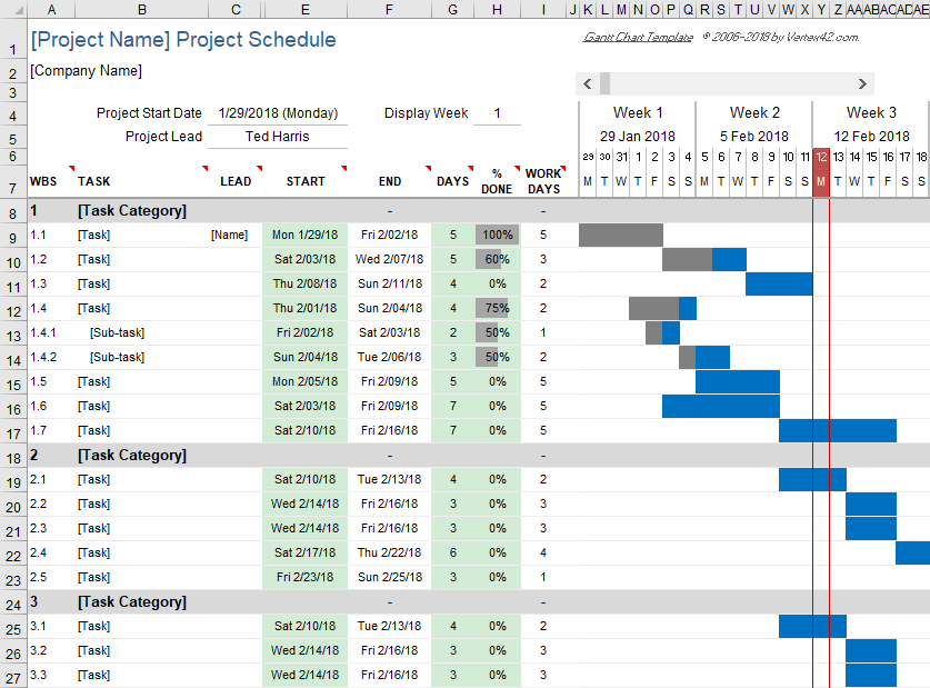
- Create a table with the task list. Before to build the Gantt chart in Excel you need to prepare the information base for its creation. All current tasks are here sorted by the start time - the earlier the execution of a particular task begins, the higher is its row. Also, for each stage you need to indicate the end date and duration in days. The most important thing is to add the maximum number of tasks, as it may be a bit difficult to do later on and so you will need to change the whole graph format.
- Build a chart. In order to create the Gantt chart in Excel please navigate on the main menu to ‘Insert’, then to ‘Bar Charts’ and select ‘Stacked Bar’. Afterwards you need to connect its columns to the previously entered data by using ‘Select data...’ command. Make sure to indicate correct values for cells ‘Row name’ and a correct range for the ‘Values’ field. When all data is indicated, you’ll need to set up showing the tasks instead of their start dates in the left area of the chart. For this, please right-click any chart row, and click ‘Select data...’ , then find block ‘Horizontal Axis Labels’ and click ‘Edit’. Now you can enter the needed cell range, from where the graph will take titles for tasks (we’ve written there in the first point above).
- Format the chart. Here we need to set up the way the information in the chart is illustrated. First of all, specify the correct sequence of tasks - click their list, then right-click for ‘Format Axis’ and check the box ‘Values in reverse order’. You may delete description for columns with start and end dates and with duration. Also, for visual clarity you may hide the beginning of the rows illustrating the tasks - by default they are shown on the vertical axis regardless the start date. You can do this just by removing cell shading and borders. And, it would make sense to remove extra spaces, emptiness which is left in the beginning of the chart.
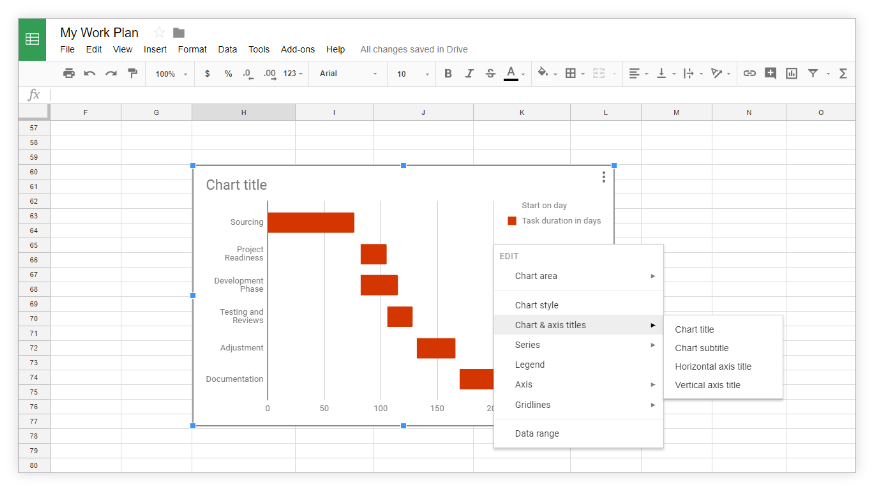
How to create a Gantt chart in Google Sheets
Google Sheets would be a handy alternative to Excel in case of collaborative work. You can create a Gantt chart here by spending some time. The particularity of working in this service lays in using functions of conditional formatting, because creating a Gantt chart cannot be achieved only with the help of standard charting tools:
- Add a spreadsheet with the full list of tasks along with their start and end dates: a column with the tasks, columns with the start and end dates, and the full list of project dates in the top row - 1 date in 1 cell.
- Select the space in an empty part of the spreadsheet; in our example we selected E2 cell, then right-click and choose the ‘Conditional formatting’ menu item.
- Go to the Formula bar and indicate there the formula ‘=И(E$1<=$C2;E$1>=$B2)’. E1 means the first cell with the dates of the whole project, C2 means the cell with the end time for the task #1, B2 shows start time for the task #1. Pay attention that this formula will be correct only if the first task is written in A2 cell, its start date - in B2, its end date - in C2, and the list of project dates starts with E1 cell.
- After the formula has been applied, the Gantt chart will be automatically generated. The advantage of Google Sheets over Excel lies not only in a possibility of collaborative work online, but also in easier way of making changes. However, when entering the new data and modifying the current one, there might be an occasional need to change the range for conditional formatting.
As you can see, to create Gantt charts in Excel and Google is really possible, however you have to have at hand either reference information, or a template that will still need to be eventually set up and edited. Such work can hardly be called simple. Thus a much more effective and easier way of integrating these practical charts into your activity would be the use of project management system Intasker. You will create a chart there literally within a few seconds.
How to create a Gantt chart in Intasker?
You won’t need to additionally create the information base with the list of tasks - they are created during daily work with the system. Thus it’s enough just to click a respective button and the service will automatically build a respective chart.
Herewith you enjoy an option to edit the source data - you may edit the timelines and priorities of tasks, add new stages, and remove particular tasks without damaging the chart look. While any change in Excel can break all the logic of chart display, you are protected from such a result in Intasker.
Moreover, it’s really handy to work remotely with the charts created in Intasker, and they can be used in team work. When changing the status and timeline of tasks, adding comments to them etc. all people in charge will receive email and Telegram notifications.
As we can see, working with Gantt charts in the specialised project management system is much easier and handier than in standard spreadsheets as Excel and Google Sheets. Besides, you can simultaneously take advantage of the wide range of other tools in Intasker.
Related articles
-
 More
MoreTask Manager
What is a task manager and why is it good? First of all, this is a handy way of accumulating in one place the information about all current tasks, of assigning people in charge of and for controlling...
-
 More
MoreProject management software - review of the best solutions
The project activity involves the use of specialized tools for control and management - normally these are field-oriented programs where all the necessary...
-
 More
MoreWhat is procrastination and how to avoid it
Procrastination is one of the main enemies of productivity, this is a habit of postponing work for later, and as the result the deadlines are...
-
 More
MoreHow to set a goal in the right way
The key condition of achieving the required result regardless the activity is the right way of goal setting. The accuracy of planning, the efficiency of resources distribution and almost all other tasks depend upon how precisely...
-
 More
MoreWhat is time management - 10 Secrets
The main resource for each work type, especially for project management, is time. Its important feature is non-regenerability: you can get additional...